Collage featuring i-D magazine cover, green forever heart card, bathroom sink flatlay, and abstract typography
8 min

Best Websites of the Month: May 2026

By WeDirectory

Explore the best creative websites of May 2026 — branding designers, commercial photographers, creative tech studios, and visual identity practices worth knowing

By WeDirectory

May's selection covers a lot of ground. A London designer who's also built a following of millions, a commercial photographer whose work moves between editorial and campaign without losing its edge, a creative tech studio behind the most talked-about albums and projects in recent memory, and a Brooklyn-based duo whose entire practice is built around the belief that visual language is its own form of thinking.

This month, we're featuring:

  • Jen Wong

  • Michael Kazik

  • Special Offer, Inc.

  • edition.studio

They're doing very different things but each one has a website that actually reflects it. We featured them as Website of the Week throughout May. Here's a closer look at each.

Jen Wong

Lilac jacket with tie-waist trousers beside Ventura Foreman London clothing labels and shipping boxes

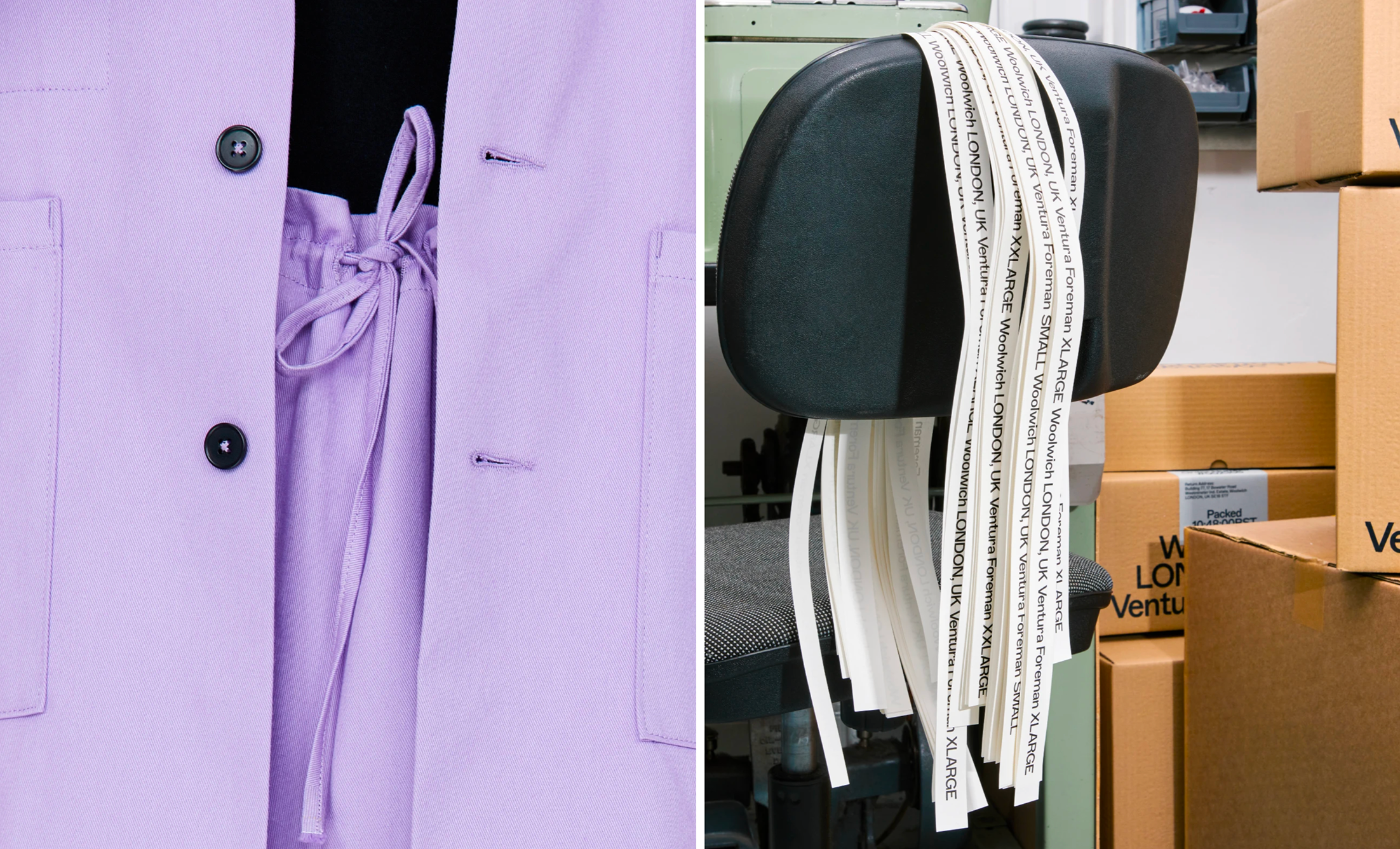
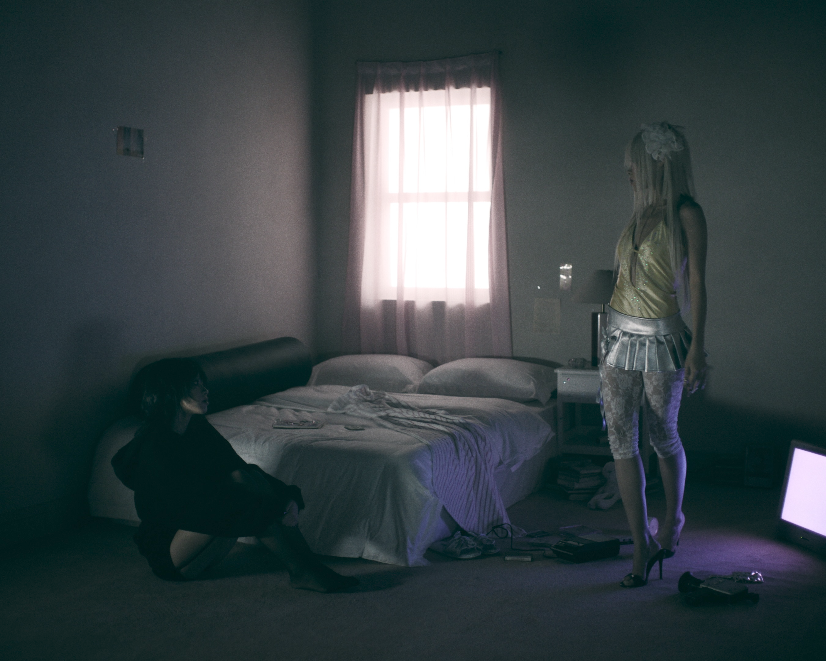
Brand Identity for Robert Ventura and Sophie Foreman by Jen Wong.

London-based and working across branding and art direction, Jen Wong has built a practice around the space where visual communication meets language and culture. Brand systems that hold up strategically, but that also carry personality and intention. 

What makes her position unusual is the parallel track she runs as a content creator. Over 5.6 million viewers have connected with her work online, through a community she's built with young creatives globally. The insights that come from that scale of engagement feed directly back into how she approaches visual identity. It's a genuinely rare combination: someone who can think through a brand and also understand, in real time, how it lands.

Her client list reflects the range of her practice. The Olympic Museum, the Hong Kong Palace Museum, H&M – institutions and brands that operate at different scales and cultural registers, but all requiring work that's both strategic and visually considered. Her website mirrors this precision.

Michael Kazik

Spiraled cucumber slices wrapped around a glass stamped with Margin brand logo, Michael Kazik photography

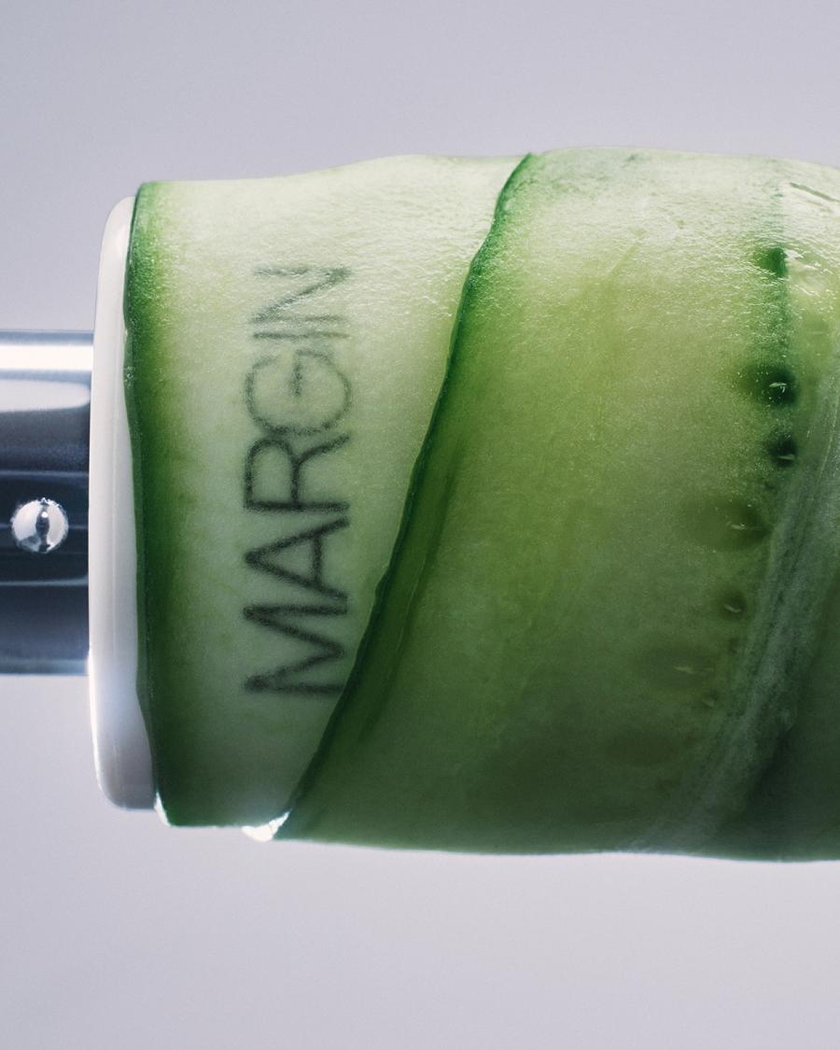
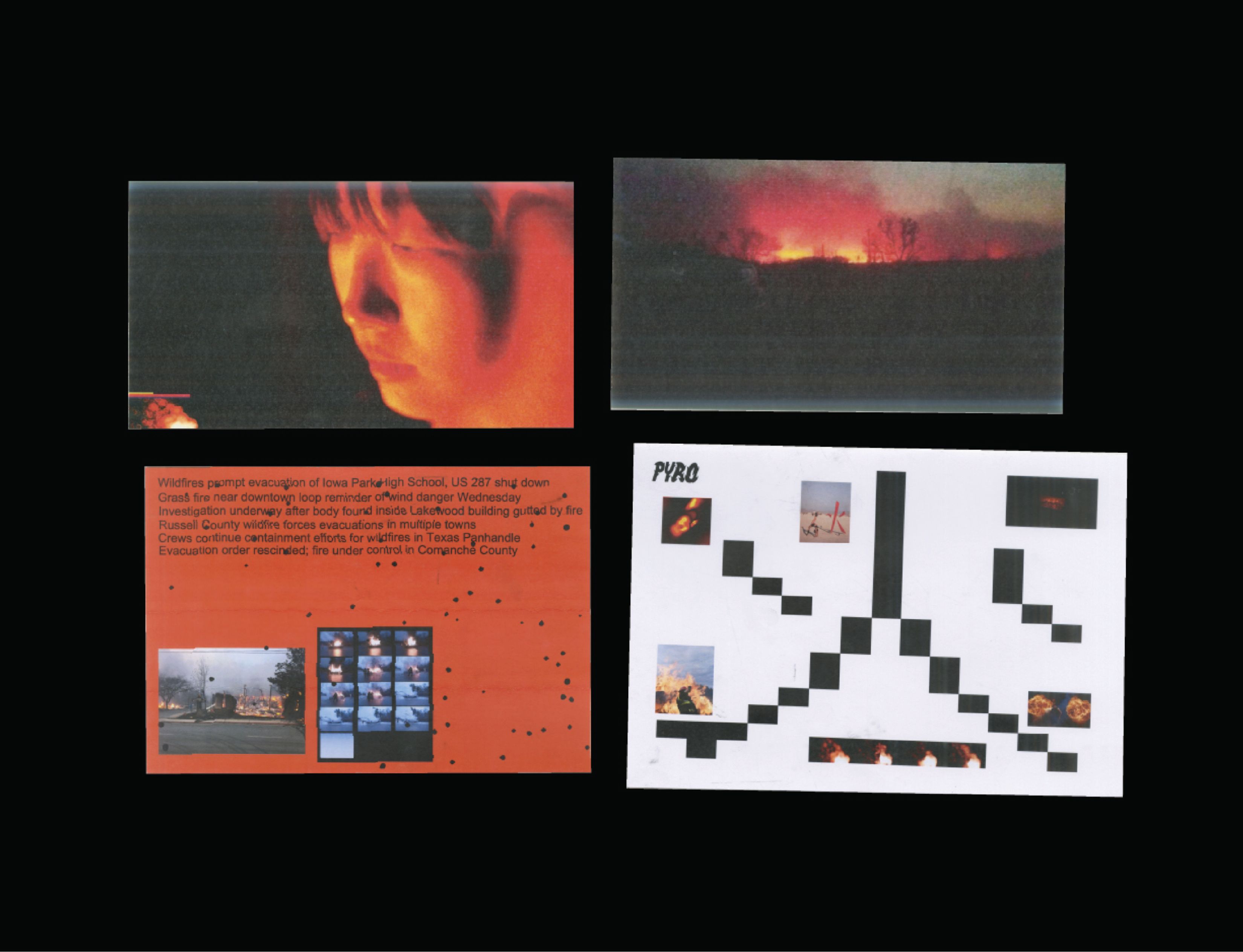
Michael Kazik photography for Margin.

Commercial photography at the highest level is a discipline people often underestimate. Getting a great shot is one thing but delivering consistently across beauty, fashion, and lifestyle – for clients with exacting standards, on production timelines that don't bend – is something else.

Michael Kazik does both. His portfolio spans Sephora, Victoria Beckham Beauty, and Salt & Stone, alongside editorial work for S/ Magazine and Sharp. Mike Kazik's work doesn't read as advertising pretending to be editorial, or editorial awkwardly applied to commercial briefs. Each project finds its own register and that comes from someone who understands the difference between what a brand needs and what a story needs, and knows how to deliver on both.

His role as a creative producer adds another layer. It's about building the conditions in which the right image becomes possible – managing the complexity so the creative vision stays intact.

The website is worth spending time with. It's a very strong body of work.
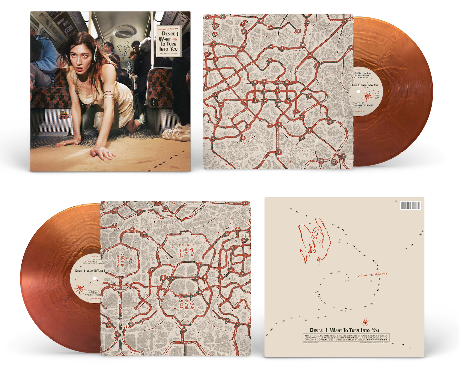
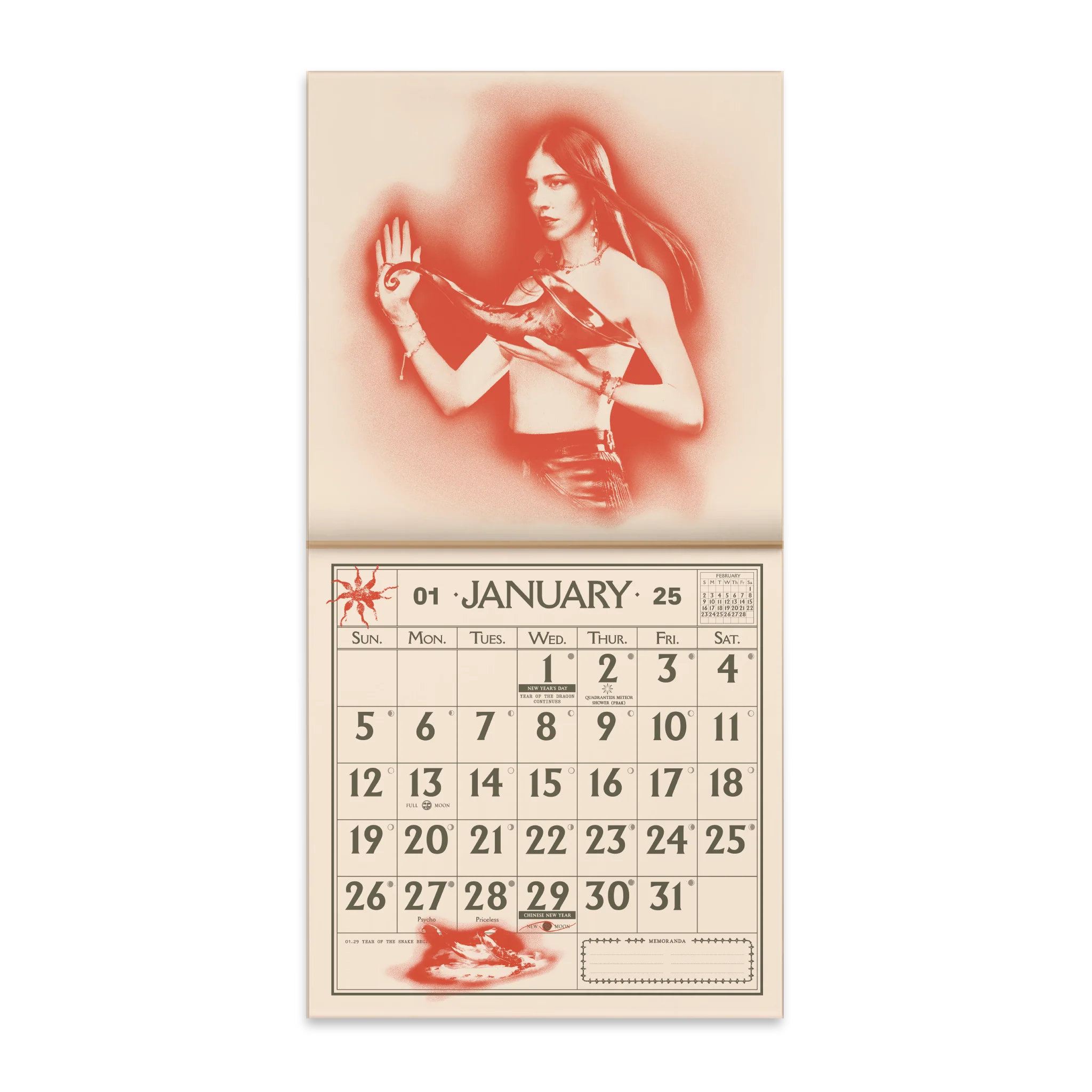
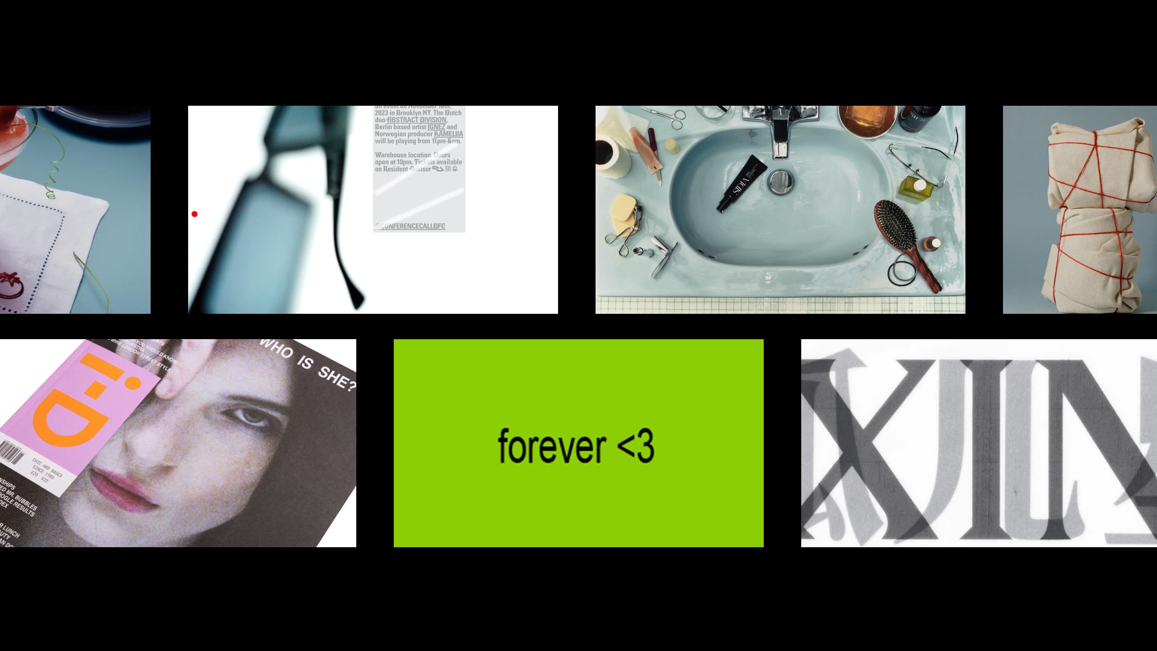
Special Offer, Inc.

Rosalia LUX album vinyl record with clear pressing and nun-inspired cover art

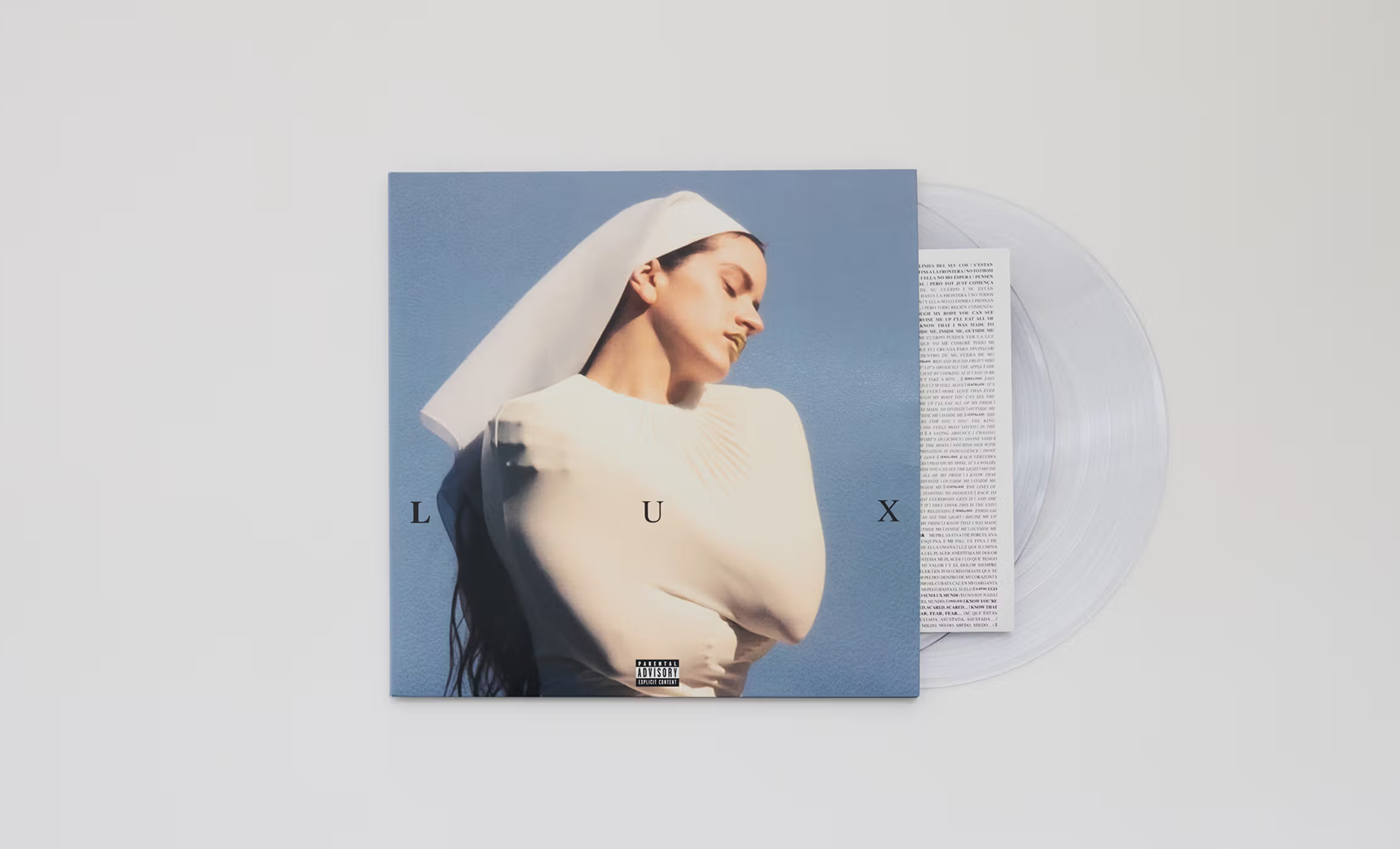
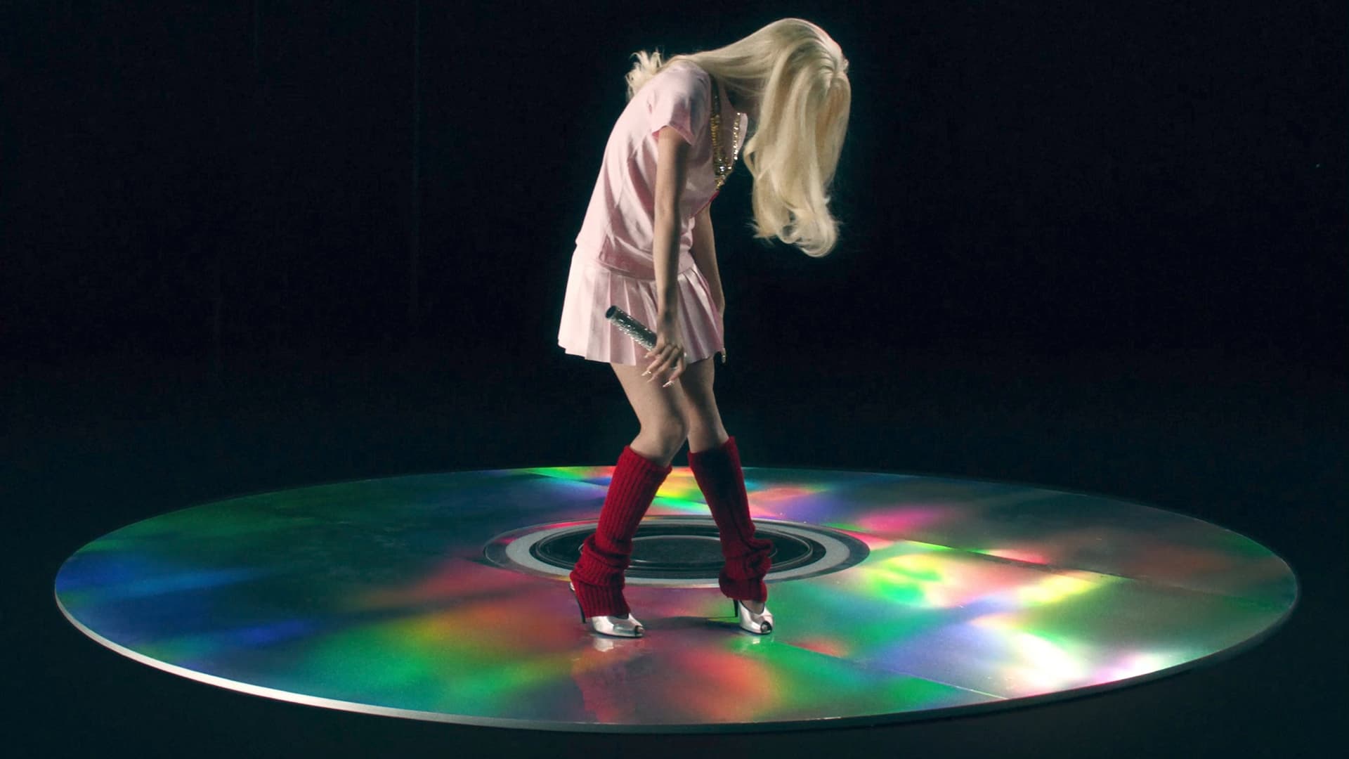
Art direction and design for Rosalía's Lux by Special Offer, Inc.

Some studios are hard to categorize, and Special Offer, Inc. is one of them – deliberately so. Based around the intersection of creative technology and subculture, they build digital experiences that feel native to the internet in a way that most agency work doesn't.

Their portfolio spans art direction, visual identity, and web development, but the thread running through all of it is an understanding of how things spread, how communities form around aesthetics, and what makes something feel genuinely of a moment. The Charli xcx Brat campaign is probably the most visible example – a rollout that became a cultural phenomenon, a color, a meme and a whole vocabulary. The kind of project that looks obvious in retrospect and is almost impossibly hard to engineer in advance.

Alongside that: work for Nike, Louis Vuitton, MoMA, i-D Magazine, Tame Impala, Rolasia, Yung Lean and MOCA Los Angeles. The range reflects a studio that operates where art direction meets internet culture, and takes both seriously.

The awards are there, but the more interesting credential is the track record. Special Offer, Inc. keeps showing up at the intersection of culture and digital experience at the exact moment things are moving. Their site is, as you'd expect, a considered piece of web design in itself.
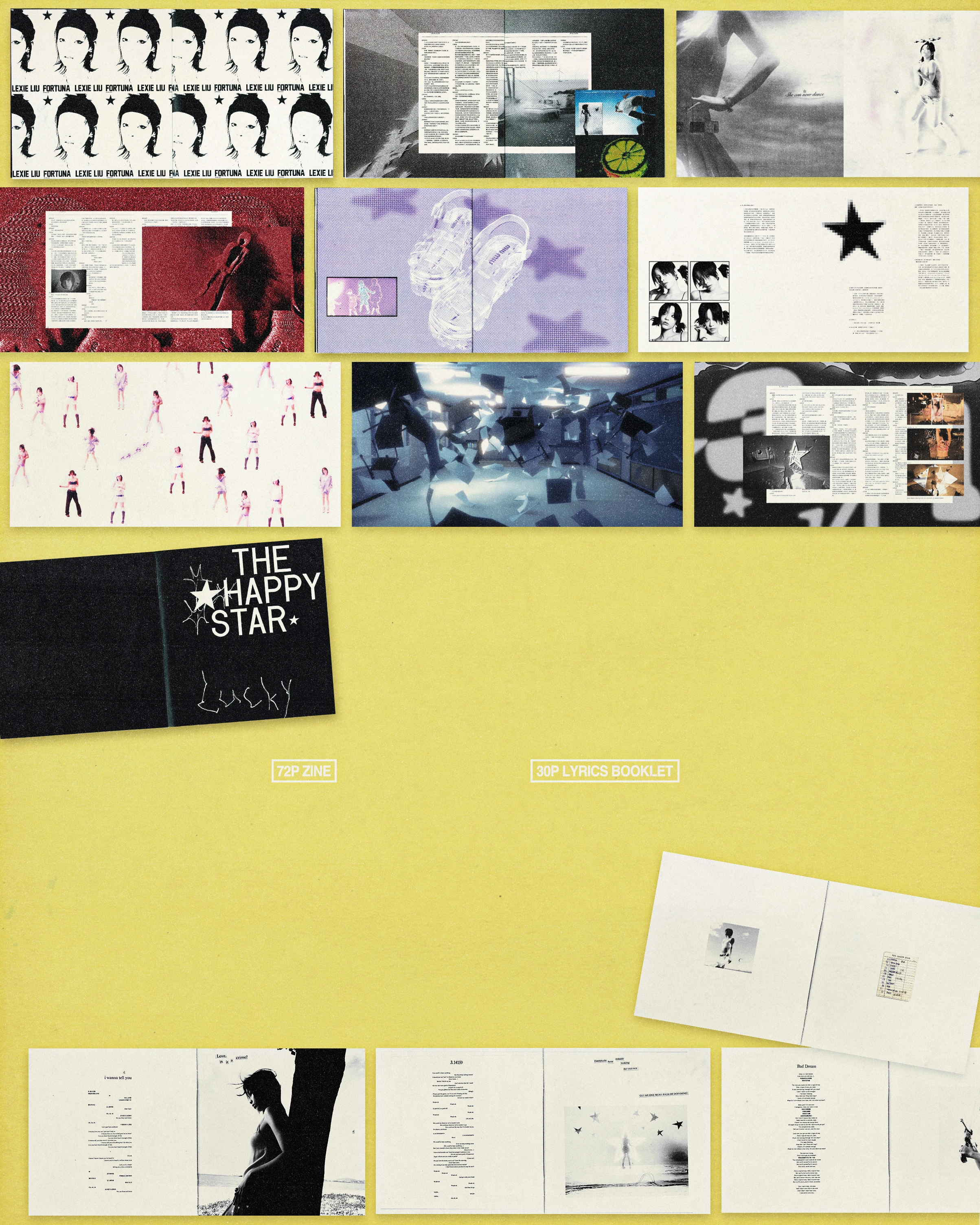
edition.studio

Colbo NYC branded packaging designed by edition.studio, 51 Orchard Street New York

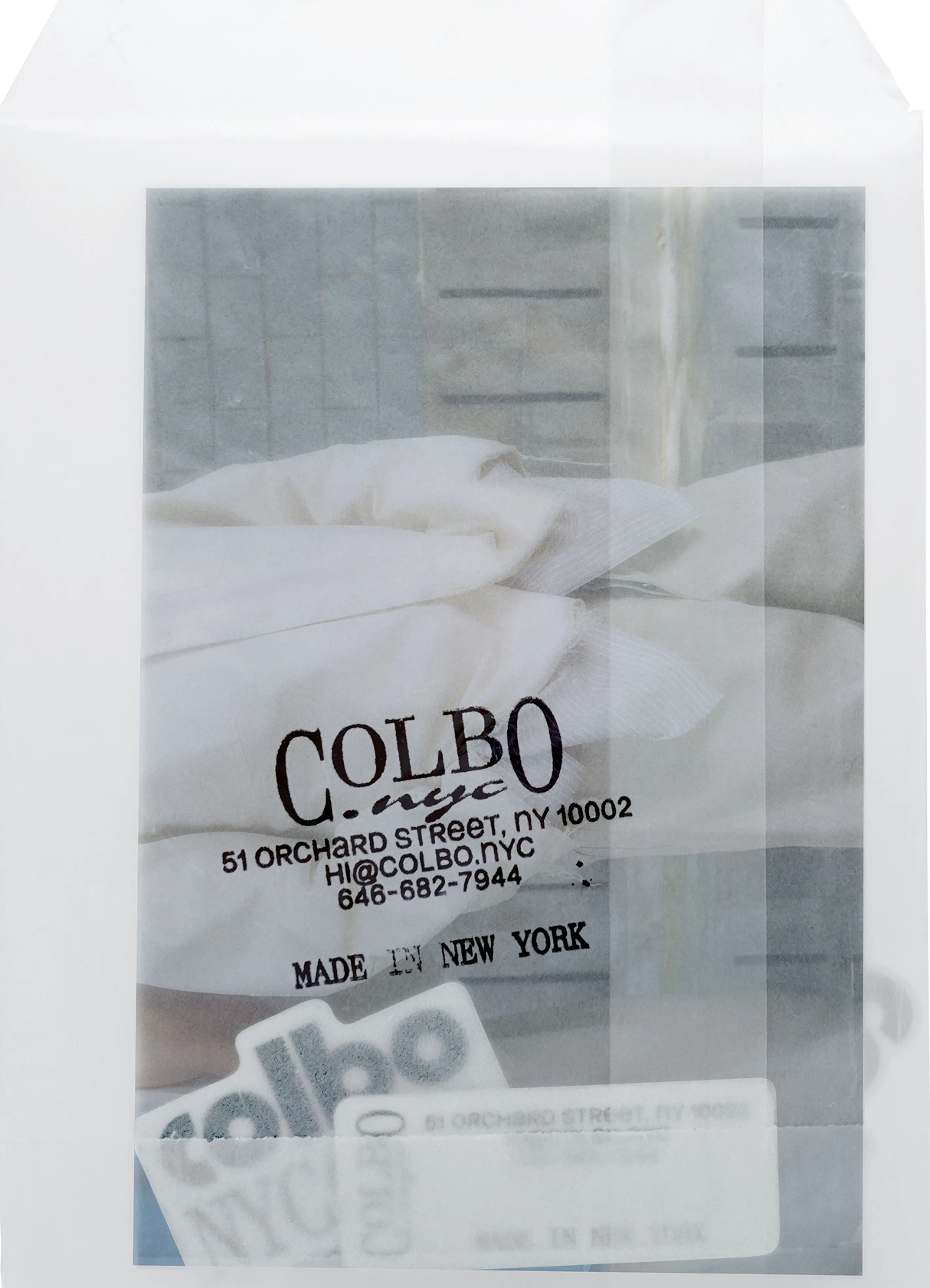
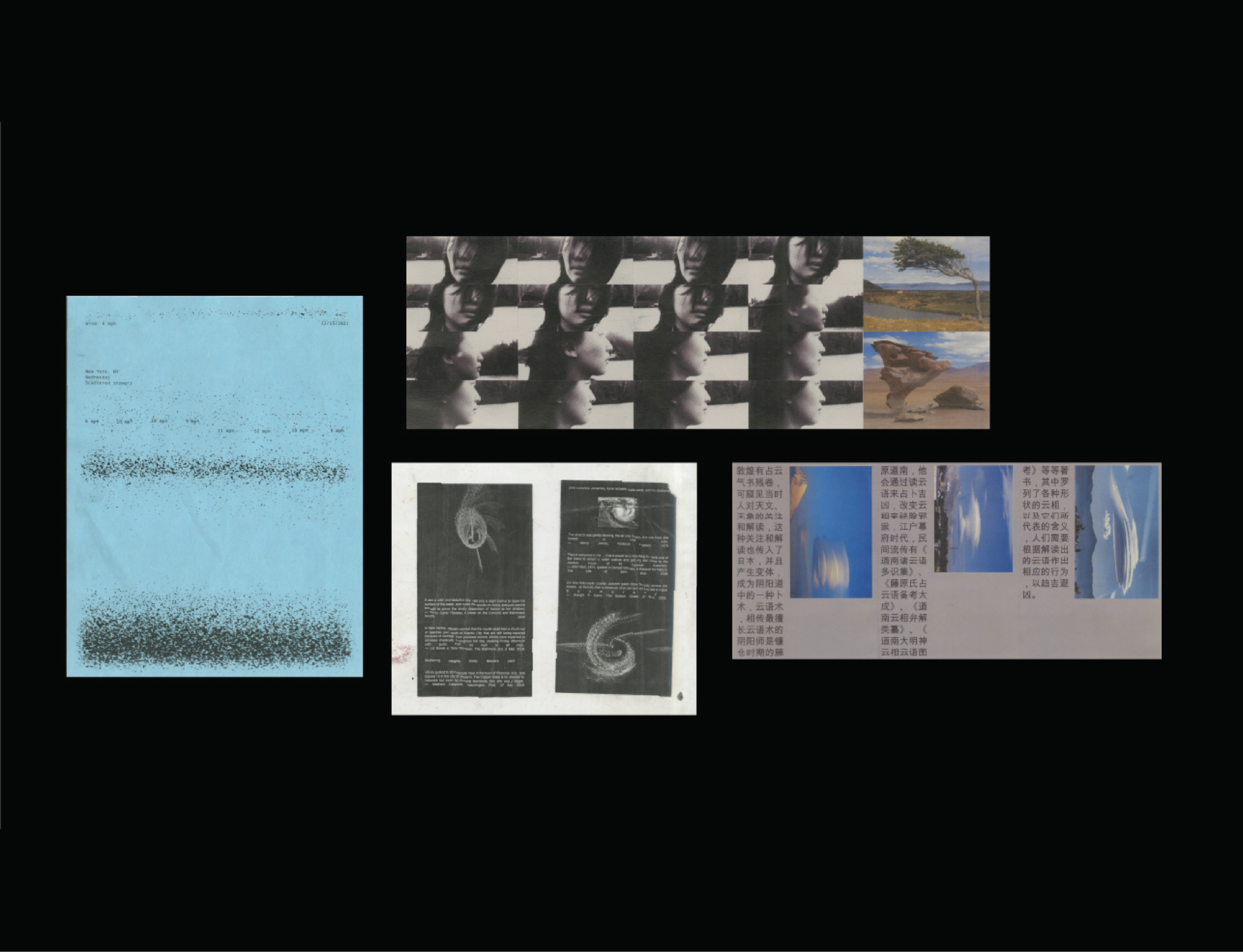
Colbo NYC branded packaging by edition.studio.

edition.studio is defined by its belief: that visual language is a form of thinking, that how something looks is inseparable from what it means.

Founded by Victoire Coyon and Adrien Menard and based in Brooklyn, edition.studio works across art direction, visual identity, type design, books and web – for international clients who want something carefully considered. The collaborative structure matters here: two distinct sensibilities working through each project together, which tends to produce work that's more considered than what a single-person studio or a larger team might deliver.

Their client list reflects the genuine range of the practice: Centre Pompidou, Villa Albertine, and AICA sit alongside Nike, Hublot, and Universal Music. Fashion brands like Giu Giu, Lafayette 148, and G.H.Bass. Publications like Suited Magazine and VICE. Artists like Guillaume Bresson and Ike Edeani. That spread points to a studio that's equally comfortable with the logic of a museum identity and the demands of a fashion campaign.

Their focus on typography and imagery as carriers of identity gives their work a particular coherence – projects feel like they've been developed from the inside out. The type choices, the image logic, the overall visual language: all of it reads as the result of a consistent set of values, applied differently each time.

For clients building long-term identities rather than just immediate visibility, edition.studio is the kind of partner that's genuinely hard to find.

The Selection

Four different practices, but a few things run through all of them. Each one has a specific position – not a general offering, but a clear answer to the question of what they do and why it matters. Each one has built a body of work that's consistent without being repetitive, and each one has a website that actually communicates who they are.

That last point is worth sitting with. A portfolio site is an argument – for a particular way of working and a particular set of values. The best ones make that argument clearly, without overexplaining. All four of this month's features do exactly that.

If any of them are relevant to what you're building – reach out. The best creative work usually starts with a conversation.

Author

WeDirectory

Date

29.05.2026

Tags
Creative Technology & Innovationcreative websites 2026best design portfolios 2026WeDirectorywebsite of the weekbranding designer Londonvisual identity studiocreative direction portfoliocommercial photography portfoliobeauty photographyfashion photographycreative tech studiodigital experience designsubculture designbrand identity designart directiontype designeditorial designBrooklyn design studioweb design studioJen Wong designerMichael Kazik photographerSpecial Offer Incedition.studioCharli xcx Brat campaignSephora photographyVictoria Beckham BeautyNike creativeLouis Vuitton digitalMoMA designHong Kong Palace MuseumOlympic Museum brandingS/ Magazine editorialtypography and imageryvisual languagecollectible designindependent design studiocreative portfolio websitebest creative portfoliosMay 2026 designvisual culture 2026
Performer on giant CD prop in pink dress and red leg warmers, Lexie Liu Pop Girl music video
4 min

Aaron Deng: Interview on Sound, Motion and Digital Identity

By Grace Palmer

Sound reacts, visuals respond, identity performs – Aaron Deng on the design thinking behind some of contemporary pop's sharpest aesthetics.

Aaron Deng is a multi-disciplinary artist focusing on the gap between digital design, motion graphics and synchronized audio-visual experiences. In this interview, Deng illuminates the analog and digital conflation in his independent project DICTE, the possibilities of immersion within graphic design, and the experience he had working on ‘Pop Girl’ for Lexie Liu.

Your independent project, DICTE, uses visual and audio sensations to explore the naturalistic elements Earth, Water, Fire and Wind. What draws you to traverse and conflate the digital and natural within your independent projects?

I was really interested in how audio behaves differently in analog and digital media,  which led me to experiment with sound-driven visuals. I became drawn to interactive design quite early on, and TouchDesigner was a starting point for that exploration. 

In college, I took a class called Device Art, where I built a small interactive device using Arduino and an ultrasonic sensor—when someone moved closer, the audio and generative visuals would respond in real time. That project was a small experiment, but it introduced me to considering visuals as something that can react to sound and movement. 

DICTE by Aaron Deng: four-panel collage featuring wildfire news headlines, fire photography, and pixelated PYRO text artwork

DICTE by Aaron Deng. © Aaron Deng

DICTE by Aaron Deng: mixed media collage with blue document, repeated portrait, Chinese text, and astronomical imagery

DICTE by Aaron Deng. © Aaron Deng

How much of your work is concerned with immersion – this idea of creating environments and experiences for your viewer through your creative direction?

Yes—through collaborating with different kinds of people and across different contexts, I’ve been exploring how immersion can be constructed in different ways.  In formats like music videos or live shows, it’s very direct because visuals are part of the performance. They have to work together with lighting,  production design, styling, and even the performers themselves, all supporting one another to create a cohesive environment and experience. 

Scene from Pop Girl music video by Lexie Liu, directed by Aaron Deng, dim motel room

Pop Girl - Lexie Liu Music Video. Director: Aaron Deng. © Aaron Deng


In a constrained context, such as graphic design, the approach varies.  Since there isn’t a physical space in the same sense, immersion comes more from building a visual language - through typography, color, imagery, and layout systems - allowing these elements to extend across different formats. When they appear across posters, packaging, motion, or digital platforms, they begin to form a coherent atmosphere rather than isolated design pieces. For me, that’s another way immersion can exist within graphic design. 

Caroline Polachek Desire I Want To Turn Into You vinyl LP package with copper colored record

Caroline Polachek, DESIRE, I WANT TO TURN INTO YOU. Vinyl Package Design with Studio Pending. © Aaron Deng

Caroline Polachek Desire I Want To Turn Into You January 2025 calendar designed by Studio Pending

​Caroline Polachek, DESIRE, I WANT TO TURN INTO YOU 2025 Calendar design with Studio Pending © Aaron Deng

Many of your projects stem from a wider variety of collaborations with artists, commercial brands, and fashion designers. How important has it been to work with such a diverse range of clients? What inspiration have you gained from them?

I really enjoy collaborating with creatives. Every industry has different needs, which means the emphasis in visual work also shifts accordingly. Through these diverse collaborations, I’ve learned to understand and adapt to different priorities while still maintaining my own artistic voice. 

I also like moving between different contexts. That sense of transition keeps me sensitive and curious, and prevents me from getting stuck in a single, fixed mode of expression. 

AA Club Series 01 activewear campaign by Aaron Deng featuring CGI and real model poses

Designs for AA CLUB, active wear brand by Aaron Deng. © Aaron Deng

Your artistic direction for Lexie Liu’s music video ‘Pop Girl’ further thrust your career last year. The video explores the contemporary necessity of perfectionism in the digital age. What drew you to incorporating these ideas into the video’s design and narrative?

The idea for ‘Pop Girl’ started from a simple observation. Today, our self-image is shaped and amplified through screens and social media, where  “perfection” often becomes something constantly pursued and performed. I  was interested in how identity can almost become a kind of product in that environment. 

In the video, we approached ‘Pop Girl’ like a manufactured icon—something polished, staged, presented and consumed. Visually, we leaned into that idea through a very glossy, almost commercial atmosphere, with stage-like spaces and highly controlled imagery. It looks very perfect on the surface, but there’s also an artificial quality to it. That tension between perfection and unreality reflects how digital culture constructs idealized identities today. 

Lexie Liu performing Pop Girl on stage, blonde hair, pink glasses, holding microphone

Pop Girl - Lexie Liu Music Video. Director: Aaron Deng. © Aaron Deng

Your career began largely operating within Shanghai’s music and fashion video scene before your later move to New York. What differences have you noticed between these two cosmopolitan spaces in terms of their artistic sensibilities?

I think Shanghai has been developing incredibly quickly. In recent years, market demand has grown rapidly. For creatives, it’s a friendly environment due to the commercial opportunities.  New brands and platforms keep emerging, and visual work can extend into many different areas of the market—such as designer brands, lifestyle stores, advertising,  and so on—constantly creating new visual needs. 

New York, on the other hand, feels like a place where many industries are quite mature and have a longer history of development. The structures of collaboration across different fields are more established, and projects often have clearer role divisions. At the same time, because people from all over the world work here, the creative environment is very diverse. 

But at the same time, I also feel that many of these differences are gradually becoming smaller. Today, almost everyone in the world is communicating within the same online space. Contents and creative work are constantly being shared and reposted across different platforms. As visibility increases, the boundaries between cities—and even between industries—are becoming less distinct.

Lexie Liu THE HAPPY STAR Lucky album package design showing 72-page zine and 30-page lyrics booklet spreads

Lexie Liu THE HAPPY STAR Album Package Design. © Aaron Deng

Lexie Liu dancing on glowing pink LED floor in Pop Girl music video directed by Aaron Deng

Pop Girl - Lexie Liu Music Video. Director: Aaron Deng. © Aaron Deng

AA Club by Aaron Deng Series 01 Socks Bocks promotional poster with glitch-effect figures

Designs for AA CLUB, active wear brand by Aaron Deng. © Aaron Deng

Gone Gold album tracklist by Lexie Liu, six vinyl record visuals by Aaron Deng

Designs for GONE GOLD by Lexie Liu. © Aaron Deng

Date

25.05.2026

Tags
Digital Media & TechnologyAaron Dengmotion graphicsaudio-visual artdigital designDICTELexie LiuPop Girlmusic video directionTouchDesignergenerative visualsimmersive designcreative directionShanghai art sceneNew York creativesdigital identitysound-driven visualsinteractive designmultimedia artistcontemporary art interviewWeDirectory